Pages

December 7, 2010

The Origin version 2

Gah! It's been forever since my last post! 

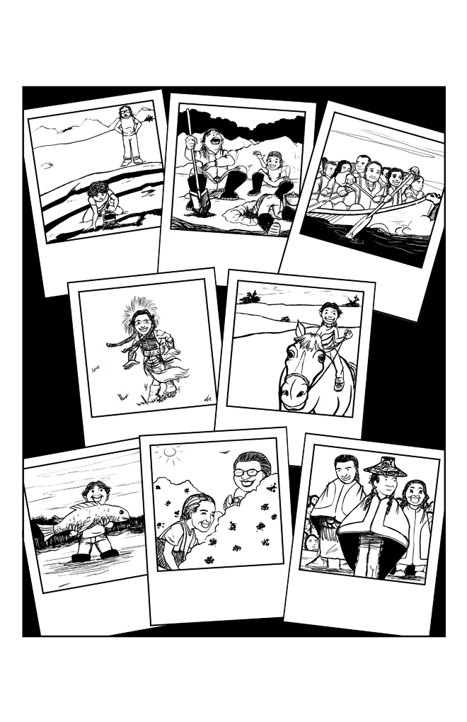
I've been working away for Jason for the last month or two, and I thought I should post what we've put together. Jason seems to be shying away from these pencil+ink pages, so I figured I would show them here, above the straight B/W images (those are in the post previous to this one). If and when I get lettered versions of these pages I'll make sure to post them so that you can really see what the story is all about.


Which gets me thinking... Comics without text: I've read/heard numerous times that a comic page needs to be able to stand without the text. That as an artist, you're not doing your job if the reader can't understand what's going on without reading the text. It's something I've believed for a long time, assuming that those who said it knew what they were talking about. Now though, my opinion is starting to shift. Comics are, by definition, the marriage of words and images. And often, the use of words falls as much into the territory of "image" as it does "word". Text boxes direct the eye, while the length of each batch of text helps define the amount of time passing in the panel. These things are important, and, I would say, should be accounted for when designing the page. What do you think? Does a reliance on text weaken comics work, or does it strengthen it?


While working on these pages, I spent a great deal of time listening to Webcomics Weekly, a podcast put on by Scott Kurtz, Kris Straub, Dave Kellett, and Brad Guigar (click here if you want to take a look at their work). During that time I found myself rekindling my love of cartooning a la Calvin and Hobbes and it finally clicked for me why I've always preferred more stylized images. I grew up loving 3 panel comics, I devoured them constantly (Garfield was a longstanding favorite) and all that time spent pouring over the work of cartoonists in my formative years helped to shape my personal preferences in my adult life. Which is all a round about way of saying two things: One, if you like cartooning, take some time to listen to the Webcomics Weekly podcasts, they're a ton of fun, and incredibly informative. And two, if you notice that my work starts to take a decided turn towards the styles usually found in the funny pages... now you know why. I won't stop doing full pages, as I just don't see myself working 3 panels at a time, but I'd be very happy to follow along in the footsteps laid out by Jeff Smith.

The Origin version 1


October 18, 2010

vs The Great Cheyenne

Another 2 pager done up for Jason Eaglespeaker.


vs Two Toes

Holy molee it's been a while since I last posted here! Fear not though, I've been hard at work and am happy to share some of what I've been up to.

Wrapped this up about a month ago:
As suggested earlier, I'll try to publish the lettered versions of these (and other works) in the future.


July 7, 2010

June 30, 2010

Next Up: Green Goblin

Pencils are feeling pretty rough compared to what I had for Venom, but I was itching to get this into photoshop and start with the refining/inking/coloring. I'll try to get a finished version up soon.


June 29, 2010

Color: VENOM!

Neil made a good point about the tip of the tail. It was something that I had noticed too, but was hoping to get away with. I should know better by now :)

Anyways, here's the new version on top, and the older version below.


What'dya think?


June 22, 2010

VENOM!

We're finally back to the artist challenges! First up: Venom.

I've opted to work out a combo between old school Bagley Venom, and current day Venom (Symbiote+Mac Gargan). Just a rough for now, but I'm feeling pretty good about it. Might even go from here to color...


June 20, 2010

Trusk

A character that I put together to fill some of the holes in the party of the D&D game that I'm running at the moment. Once I finally figured out what I wanted him to be, the whole character came to life in my head, so I figured I'd see if I could get him down on paper. Once I finalize the design I'll start playing around with color too, so check back to see how he's coming along.


Ryan

Rough sketches for a character that I'm developing for an upcoming comic work. Lots of decisions are still being made at the moment though, so I won't go into any details.


Week 3

Drawings from last weeks session. This is probably the first time any of us have dealt with a professional model who was actually attractive. I think it threw everyone off their game a bit, and quickly kiboshed our plan to do some extreme exaggeration.

Oh, and the guy with the apple was one of the other artists... I got bored during the break.


Week 2

A few sketches from the second week of figure drawing. Had a tough time this night, as I couldn't really find anything interesting in the model to play with. You can see that I started to play up his lack of interest by turning him into a golem type character, but even that feels a bit lacking.


Week 1

Started attending figure drawing sessions a few weeks ago, and thought I should share. I'll try to post a small collection from each night. Enjoy!